One of the often-requested features to be implemented for Smart Contact Reminder were contact statistics. Even though the contact logs are readily available on the History screen, some sort of aggregated view of the data regarding your contacts and connections was missing.
Logged contact statistics
With Smart Contact Reminder version 2.0, everyone (regardless of whether you’re a free or premium user) gets a brand new feature – Contact statistics. Thanks to this, you can get an overview of your past logged contacts in several charts. They are available from the main bottom navigation menu under the Statistics tab.
In the first iteration of the statistics feature, we’re introducing three charts as a start. Contact log count, log types and list of top contacts for the past 12 months. Let’s take a closer look at each of the types of charts that are available.
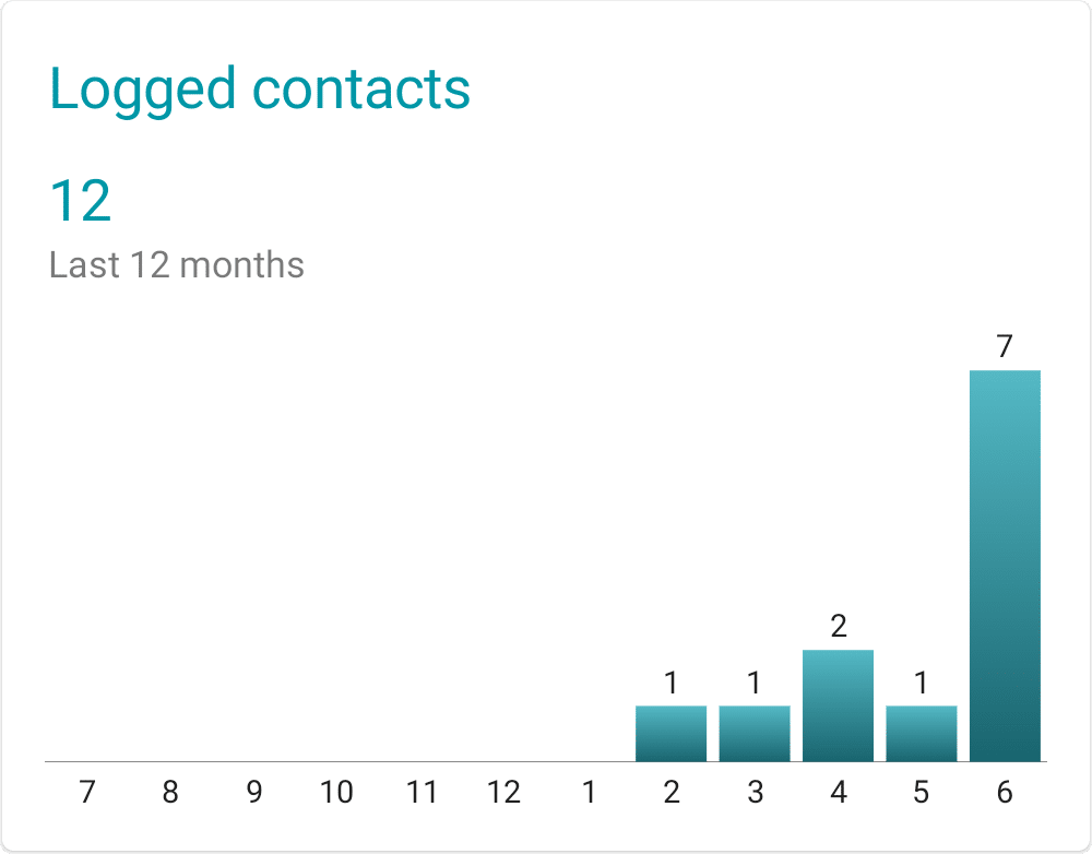
1. Contact count
Firstly, it is a chart of your logged contacts for the past 12 months. The chart is split into months (the X axis labels representing the month of the year) and the bar height shows number of contacts logged for this particular month. Tapping on the chart gives you more detailed information.
Thanks to the contact count chart, it’s easy to see a monthly trend of number of contacts logged in the past year. Keep those numbers growing and nurture your relationships! One of the easy ways to keep your connections alive is to add birthday and anniversary reminders to your contacts. Find out how Smart Contact Reminder can help you with that in our previous blog post.
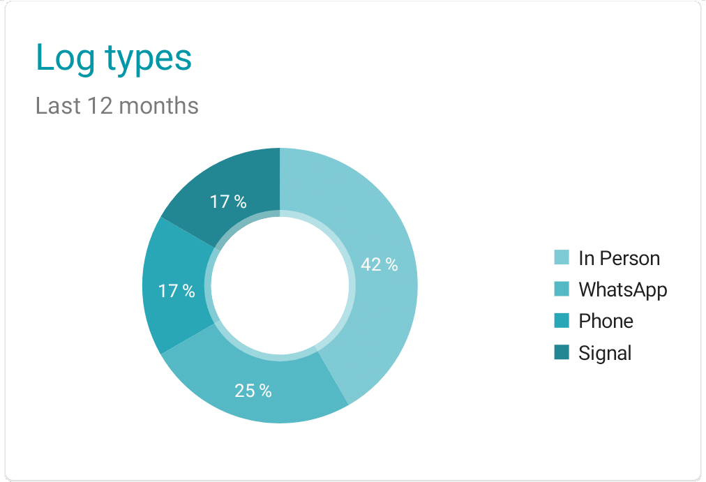
2. Log types
When logging a contact, you can add an optional type. The type usually means either the way you got in touch with your connection. For instance it can be: in person, meeting, phone call or a text message. Also it can contain the app’s name you’ve used to contact them with.
If you’re a premium user and use the automatic contact detection feature, it automatically fills in the contact type value from the app’s name that triggered the auto-detection algorithm.
The pie chart represents the fractions of types of all your logs in the past 12 months. You can learn that way which means of communication you use the most to maintain your connections. Furthermore, tapping on the chart gives you more detailed information including number of contact per each type.
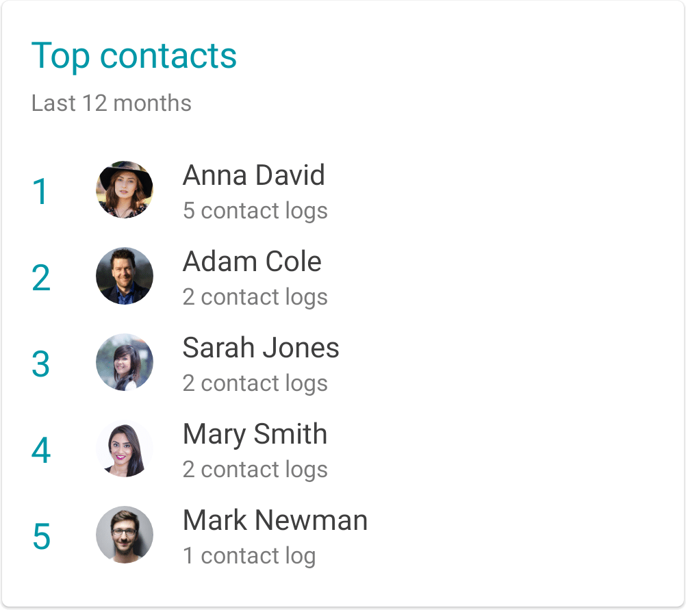
3. Top contacts
Last of the cards represents the most contacted connections in a form of a leader-board. You can quickly see who’s your most-often-contacted connection.
What’s next?
We’re always thinking of how to make Smart Contact Reminder more useful and how it could help you more stay in touch with your friends, family and/or business connections.
Therefore, we’re already planning expanding on the idea of statistics with per-contact stats and suggestions on how to improve your relationships. We’re also thinking about gamification of logging the contacts so that keeping in touch regularly is fun and engaging. ❤️
You can get Smart Contact Reminder from Google Play and give it a try immediately!
Photo by Jason Coudriet on Unsplash